Transparency Criteria #66 for the proxy states: “The document includes disclosure of CEO and average NEOs pay mix presented as a graphic or using other visual elements.”
The “pay mix” graphic is designed to demonstrate that the CEO and other NEOs’ target compensation is appropriately at-risk and tied to performance. While some pay mix graphics may also weave in ratios of equity to non-equity or short to long-term, most pay mix presentations are high level. This is why the graphics are often found in the proxy summary. A simple check-the-box for readers that the company’s compensation program is performance-based.
Some companies present “pay mix” graphics with its compensation elements overview (see my recent blog about that overview). Together, they provide a more comprehensive snapshot of the program and insight into design objectives.
Some companies even go the extra mile and place a high level pay mix graphic in the proxy summary – and then also include a more detailed pay mix graphic in the CD&A summary.
Here is an example from Lowes’ 2023 proxy (page 29) that uses circles:
This example from the ConocoPhillips 2023 proxy (page 72) uses a bar graphic (and also is an example of a pay mix graphic with an elements table):
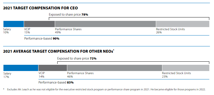
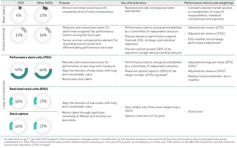
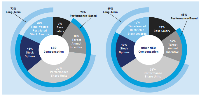
And I really like this example from the 2023 Mastercard proxy (page 70) too: